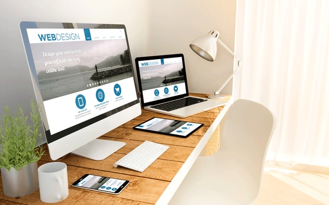 In 2016, just about every business I can think of has a website. However things change very, very quickly in the wild world of the web, so much so that even websites that were built only a couple of years ago may look outdated by now. Or, they may lack functionality that is now commonplace. While it’s easy to make changes to your website content or to tweak some simple design elements, sometimes it’s necessary to do a complete website redesign. When you’re ready to do a total overhaul of your site, these are a few elements that we don’t think you should leave out this time:
1. Mobile web optimization
I probably don’t need to tell you just how much people are accessing the web from devices other than their desktop or laptop computers. Smartphones and tablets have become so prevalent, and in many cases, so affordable that they seem to be in everyone’s hands, almost regardless of age or economic status. What you may not know however, is that recent changes to Google’s search algorithms now give strong preference to mobile-friendly sites in their search rankings. You had better make sure that your website redesign looks good and is functional on mobile devices, so that potential customers don’t skip over your site and go on to the next competitor. But if you don’t pass Google’s mobile-friendly test, phone and tablet users may not even find your site.
2. Hamburgers (no fries)
A recent innovation in websites as well as apps, both mobile and desktop, is what has come to be called the “hamburger menu”. If you’re reading this in the Chrome browser, look up to the top right-hand corner. That icon with 3 lines which you can click on to reveal a menu is the hamburger. (Why? Think of a burger patty in between two buns.) Although it’s somewhat controversial among web designers, it’s generally considered to be a useful tool, because it saves precious screen real estate that expanded menus take up.
3. It’s in the cards
A current trend in website redesign involves the use of an element known as card design. If you use Pinterest, you know what we’re talking about. Rather than including all the information on a page in a monolithic block of text, cards break that info up chunks. It’s easy for a website visitor to scan through the cards, and only expand the ones that they’re really interested in. It leaves your page looking cleaner and tidier, as it’s not cluttered with too much text.

Comments