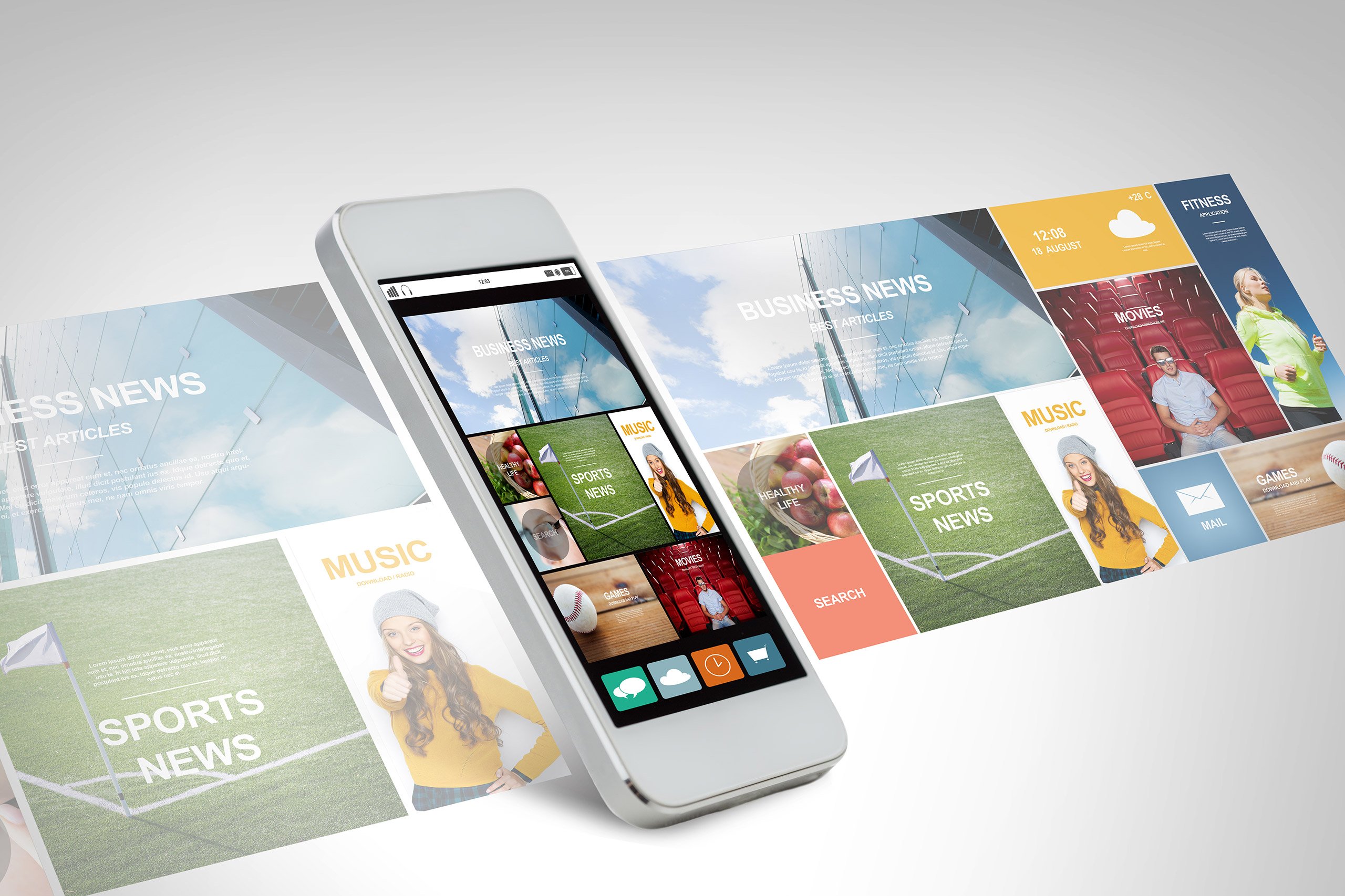
Of course, the proliferation of mobile devices, both phones and tablets, is obvious to everyone. What may not be quite as obvious is just how much and in what ways mobile use of the internet is increasing. We all know that people are checking email and web surfing from their phones. But, would it surprise you to know that American users now spend more time connected to the internet on their mobile devices than they do from desktop computers? Or that the majority of users are now “multi-screening,” or accessing business sites from their mobile devices on a rapidly growing basis?
What all this means to marketers is that you need to be sure that your website is “mobile-friendly.” If users can’t comfortably and easily visit your website, chances are high that they’ll move on to the next site that turns up in their search results.
At one time, it was customary for website developers to produce multiple versions of the same website, to accommodate the differences between different web browsers. But with the increase in types of devices, including smartphones, tablets, and smartwatches, this involves a lot of additional work. Mobile responsiveness means designing your site to accommodate both desktop and mobile users of all types of devices.

With a responsive design, everything on your site – content, images, in fact, the whole structure of the site, will look the same, no matter what device someone is using to view it. So when someone accessess your site from their desktop or laptop computer, they’ll see the fully expanded view of your web pages, in all their glory. But when the same pages are viewed from a mobile phone or tablet, the page will adapt, or respond by scaling down to fit the smaller screen. This eliminates the need to develop multiple versions of the same page for desktop and mobile users.
In this day and age, it’s essential. Mobile users are on the go, and are doing business and researching information on the fly, so they don’t have time to waste on sites that don’t work properly for them. No one wants to look at a web page that’s truncated, with important text or images chopped off at the end of the screen. Nor do they want to look at a compressed, shrunken-down version of the desktop site. Confronted with websites that don’t look or work as expected, most mobile users will leave the site and find what they’re looking for elsewhere.
We at Rhino have learned all the subtleties of designing responsive websites. We’d love to show you how we can work with you to provide your web visitors with the user experience you want them to have, whether they’re at home or on the go.
© 2024 Rhino Digital Media, Inc.