 If you’ve been reading about inbound marketing, you’ve probably heard about the importance of a well-designed landing page, and perhaps you’ve even started implementing some of them. In case you haven’t, let’s start this discussion by clearing up any misunderstandings about what a landing page actually is. For inbound marketers, a landing page is quite simply a page which contains a form, and which exists solely for the purpose of capturing your visitors’ information through that form.
The question remains though: what makes a good landing page? The purpose of a landing page is to convert your leads, by getting them to agree to give you some information, usually at least their email address, in exchange for something you’re offering them. Your offering will usually be some relevant content, like a free eBook or whitepaper. You’ll be able to see how many people are filling out your forms and downloading your document. But how do you know that your design is optimal? Would making some changes to the landing page result in a better conversion rate?
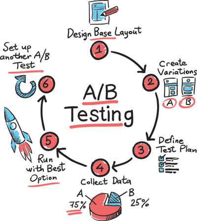
In order to find this out, you’re need a way to test your landing page. The standard method for doing so is what’s called an A/B Test. In an A/B test, which is also sometimes called a “split test”, you’re essentially performing a simple experiment. You compare two versions of your web page, in this case, your landing page, to see which one performs (converts) better. Let’s look at a few A/B tests you can use to figure out how to optimize your landing pages. It’s important to remember to test only one variable at a time. If you make multiple changes, you won’t know which altered element produced the results you're observing.
1. Images
As you design your website, you’ll certainly be considering whether to include images on your landing page, which is generally considered a best practice. But is it always the optimal design? The way to find out is to construct a simple A/B test based on two pages: one with an image and one without. The results of the test will be seeing how many people fill out the form and download your content on each version of the landing page. You can also test specific variables, like placement or size of the image.
2. Form Placement
Placing your form above the fold is a standard practice for landing page layout. “Above the fold”, by the way, is an old newspaper term referring to placement of articles in the top half of a large paper’s front page, which won’t be hidden when the paper is folded over and are thus more easily viewable. In web designer’s language, it means that the form is placed high enough on the page that you won’t need to scroll down to see it. You can do an easy A/B test using two versions of your page: one with the form above the fold, and one with the form below the fold.
3. Headlines
I doubt you’re considering leaving headlines out of your landing page, and I would not advise you to do so. But there are elements of the headlines which are worth testing, including size of the font, placement on the page, styling, and so on. Remember as always to only alter one variable per test.
There are a number of other elements you may wish to A/B test on your landing pages, such as variations in your call-to-action buttons, the use of social proof and testimonials, and all sorts of style and layout changes.
While there’s certainly value in understanding what are considered to be “best practices” for landing page design, the most effective landing page for you is the one that actually produces the highest rate of conversion. A/B testing will show you which design elements will give you the results you’re looking for.


Comments