 Conversions are one of the most important parts of the inbound marketing strategy, because that’s where a website visitor goes from being a potential customer to an actual lead. And once we have their contact information as a lead, we can start marketing to them directly on an individual basis, in the hopes of one more conversion: from lead into completed sale. Since sales are the way we make money through inbound marketing, leads are obviously critical to increase revenue.
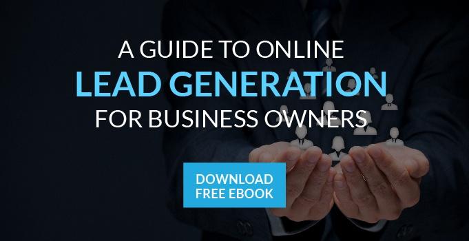
On this blog, we normally focus on content, website design and social media. But today, I want to discuss a very specific part of the inbound marketing formula: the landing page. The landing page is usually where the lead generation magic happens. On a landing page, we present the visitor with one of our content offers in exchange for their contact information. They have to agree to this exchange in order for the lead conversion process to occur. So if you’re having trouble getting visitors to click “submit,” you’re missing out on many potential leads. Here are five tweaks you can make to help increase your landing page conversion rates:
Use action words
If you want visitors to take action, you have to inspire action. Don’t be passive with your landing page sales pitch. Instead, use a strong words to create a sense of urgency. Words like “Get” and “Take” as in “Get this excellent content now,” or “Take charge of your business with this content.”
Hype up your content
Ideally, you’ve written some great, valuable content that visitors should want. But regardless of its quality, you need to do your best to really talk up the content. Use words like “transform,” “revolutionize” and “boost” – words that describe the benefit of receiving your content. You want the visitor to believe this content will have a major impact on their future success.
Make it easy
The last thing your landing page can do is cause confusion. Make sure it’s abundantly clear what the visitor should do to get your content. Your “submit” button should be big and be colored in a way that makes it pop out from everything else on the screen. Everything else on the page should be a bit muted and inconspicuous by comparison: you want all eyes on that submit button.
Keep it simple
Your landing page doesn’t have to be complicated; in fact, the simpler it is, the better. You really only need four things: an image associated with the content offer, a few bullet points about the content, a form for the visitor’s contact information and a submit button. That’s it. Anything else is superfluous and distracts the visitor from the stuff that matters: the content offer and the form.
Ensure it’s viewable on every device
The amount of web traffic generated from mobile users continues to rise, and some of those folks will definitely end up on your landing page. If they can’t see it properly on their device, what do you think is going to happen? Will they save the web address and come back to it on their laptop? No. They’ll probably forget about it and never visit the page again. Therefore, it’s critical that your landing pages are responsive and easily viewable on any device. Otherwise, you’re going to miss out on tablet and smartphone users.
Comments